
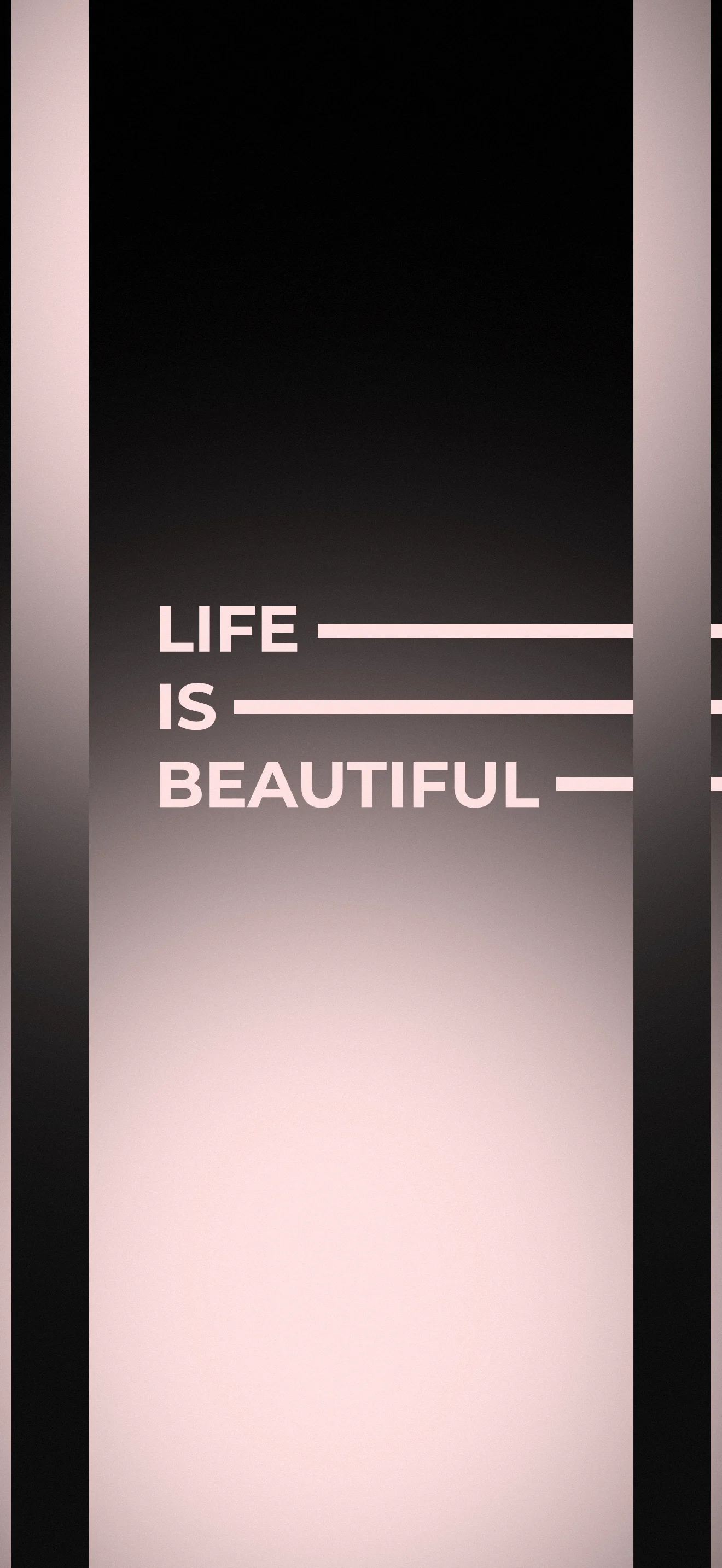
Bold, minimal, and quietly powerful. This wallpaper places the words "LIFE IS BEAUTIFUL" in large uppercase sans-serif type against a central gradient panel that transitions from deep black at the top to a warm blush pink at the bottom. Each word is followed by a thin horizontal rule — a typographic device borrowed from editorial design that adds rhythm and structure to the composition. Two dark vertical stripes flank the central panel, framing the gradient and creating a sense of depth. The overall effect is somewhere between a luxury brand identity and a late-night meditation - confident, restrained, and beautiful. Available in 1080×2340 px for iPhone and Android. Free to download, no account required.
Download Free
3 people viewing now
No account required · Original quality
Stats
Views
4
Downloads
0
Telegram Subs
3735
Threads subs
27 751
Like
Dislike
Need your like
Photo info
Dimensions
1080x2340
File size
244.45 KB
Format
Webp
Added
July 2, 2026
License
Free to use
Compatibility
iPhone 18/17/16/15/14/13, Samsung Galaxy, iPad
Other works in this category
Go to this category
About author
In an era where digital screens are our primary windows to the world, I believe that a phone wallpaper is more than just an image - it is a reflection of one’s personality and mood. My mission is to provide unique, high-quality visual experiences that standard stock galleries cannot offer.
Share this post
About this post
There is a long tradition in graphic design of letting typography carry the entire visual weight of a composition — no illustrations, no photography, just letterforms, spacing, and color. This wallpaper belongs squarely in that tradition. The choice of bold uppercase letters with clean geometric structure gives the quote a monumental quality - these words feel carved rather than printed. The horizontal line accents after each word are a direct reference to editorial typesetting, where rules (lines) are used to guide the eye and create visual hierarchy on the page. Translated to a phone screen, that editorial sensibility creates a wallpaper that feels refined and intentional — the kind of design you might see on the cover of a minimal lifestyle magazine or in a high-end brand campaign. The gradient from black to blush pink adds emotional dimension: the darkness at the top gives way to warmth below, visually echoing the meaning of the words themselves.
FAQ
What typography and design style does this wallpaper use?
This wallpaper uses a bold sans-serif typeface in all-caps - a style rooted in modernist typography and Swiss graphic design, where geometric letterforms and clean lines are used to communicate with maximum clarity and authority. The horizontal rule accents after each word are an editorial typographic technique used in magazine layouts and brand identities to create visual rhythm and separate typographic elements. The overall aesthetic belongs to the dark minimalist typography style - a popular phone wallpaper category where text-based designs on dark or gradient backgrounds are used to create a premium, editorial feel distinct from photo-based wallpapers.
What color scheme and icon style works best with this wallpaper?
This wallpaper works best with a monochrome or near-monochrome icon setup. The dark upper section pairs naturally with white or light grey icon packs, while the blush-pink lower section is warm enough to complement soft rose gold or nude-toned icons and widgets. On iOS, placing a transparent or black-background clock widget in the dark upper zone creates a seamless layered effect. On Android, KWGT widgets in black or white with minimal text work well in the same area. Avoid brightly colored or multicolored icon packs - they will disrupt the deliberate restraint of the typographic design and visually compete with the quote.
Other works in other category

Other category wallpapers