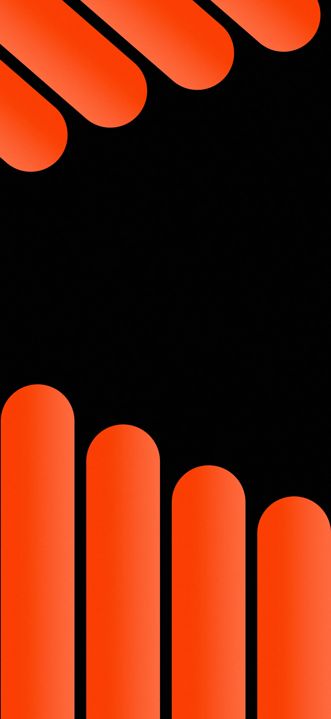
Four thick vertical pill shapes in a vivid orange-to-red gradient rise from the bottom of the screen like oversized columns, their rounded tops stopping at different heights to create a staggered rhythm across the lower half. At the top, four matching horizontal pill shapes enter the frame from the upper left corner at a diagonal angle, as if sliding in from off-screen. The black background between the two groups of shapes is wide and generous, giving the composition room to breathe and making the orange forms feel even more bold and present. The gradient on each shape moves from a warmer orange in the center to a deeper red-orange at the edges, adding a subtle sense of volume. Available in 1080x2340 px for iPhone and Android. Free to download, no account required.
Download Free
2 people viewing now
No account required · Original quality
Stats
Views
3
Downloads
0
Telegram Subs
3737
Threads subs
27 756
Like
Dislike
Need your like
Photo info
Dimensions
1080x2340
File size
161.97 KB
Format
Webp
Added
July 8, 2026
License
Free to use
Compatibility
iPhone 18/17/16/15/14/13, Samsung Galaxy, iPad
Other works in this category

Go to this category
About author
In an era where digital screens are our primary windows to the world, I believe that a phone wallpaper is more than just an image - it is a reflection of one’s personality and mood. My mission is to provide unique, high-quality visual experiences that standard stock galleries cannot offer.
Share this post
About this post
In graphic design there is a principle that negative space is not empty, it is active. This wallpaper understands that completely. The large black zone between the top bars and the bottom columns is not a gap or an oversight, it is the most important part of the composition. It creates tension between the two groups of shapes, making you feel like something is about to happen, like the columns are rising to meet the bars or the bars are descending toward the columns. That sense of movement and anticipation is what keeps the eye engaged. The pill shape itself has become one of the defining forms of contemporary design, appearing everywhere from app icons to furniture to brand identities. Using it at this scale, with this much contrast, turns a simple geometric element into something that feels genuinely bold and current. On AMOLED screens the black background disappears entirely, making the orange shapes appear to float in a void.
FAQ
What design style does this pill shape wallpaper belong to?
This wallpaper sits firmly in bold geometric minimalism, a design direction that became dominant in the early 2020s across branding, app design, and digital art. The pill or stadium shape specifically became one of the signature forms of that era, used extensively in UI design, streetwear graphics, and editorial layouts because of its combination of softness and strength. It avoids the coldness of a pure rectangle and the weakness of a circle, sitting somewhere in between with a confident, grounded feel. The high contrast orange on black palette connects it to the dark aesthetic and the sports or performance aesthetic, where bold warm colors on dark backgrounds communicate energy and intensity without using photography or illustration.
How does this wallpaper look on an AMOLED screen?
It is genuinely one of the better wallpaper types for AMOLED displays. The background is pure black throughout, which means every black pixel on an AMOLED or OLED panel is completely switched off. The orange-red pill shapes appear to glow against that genuine darkness rather than sitting on a lit grey panel, which is what you get on LCD screens. The gradient within each shape, from warmer orange at the highlight to deeper red-orange at the shadow edge, becomes more vivid and three dimensional on AMOLED because the contrast ratio is essentially infinite where the shape meets the black edge. Samsung Galaxy S series, Google Pixel, and iPhone 12 through 16 with OLED panels will all show this wallpaper at its best.
What icon pack or widget setup works best with this orange-red geometric wallpaper?
Because the composition is divided into three clear zones, you have real flexibility in how you set up your home screen around it. The large black central area is the most natural place for widgets or a clock display, where white or light grey text will read cleanly against the black. The bottom zone, where the vertical columns rise, works well as a dock area with a small number of icons in dark or black cases. The top diagonal bars create a natural upper frame that works with the status bar. For icon packs, white monochrome icons or black icons both work well. Orange or red tinted icons can be used to extend the color theme, but keep the count low. The strength of this wallpaper comes from restraint, and the home screen setup should match that.
Other works in other category
Other category wallpapers